A Ui color palette based on accessibility – TrustYou’s new color palette
I want to start off by mentioning that the realization of this has been possible thanks to the joined efforts with the marketing department at TrustYou. And I wanted to give a special thank you to my colleague Martina Schloemp for the support and for pushing it forward.
The concept behind this work was generating a new UI palette for the present and the future, for one and for all, flexible and accessible.
This article intends to talk about the mental process and the mistakes leading to the final product.
...You read right: mistakes ❤
A long time ago in a galaxy far, far away….
Our color palette was based on the colors of our logo except for the darker blue that was missing. To that, we had an added grayscale plus pure white and black. The gradients stemmed from the original logo colors turning then darker and lighter respectively.
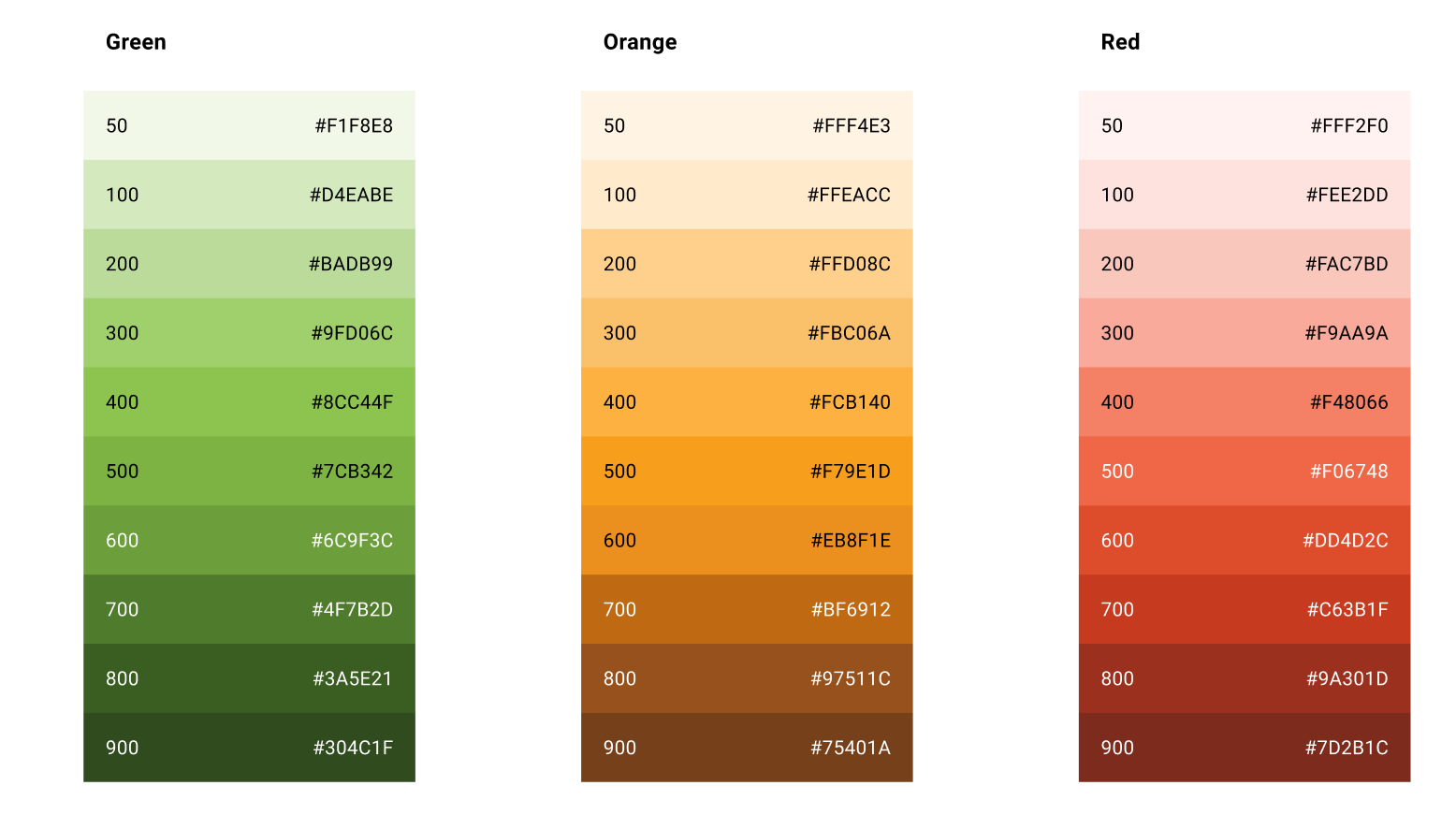
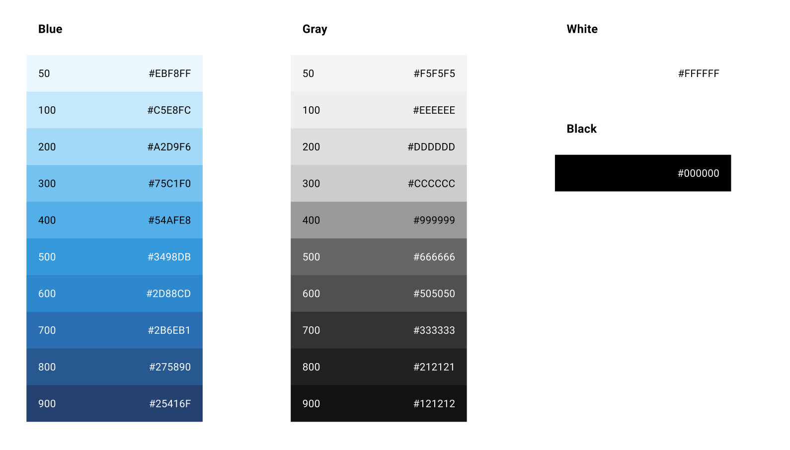
After doing a thorough analysis of the current color palette in terms of color theory, it was also put to test using different components to check its adaptability to the current accessibility standards WCAG 2.1.
We had two big milestones when it came to our palette:
1.Having the right color palette
2.Using the color palette right
Having the right color palette
With the number of products increasing within TrustYou and with the need for new graph visualizations throughout the entire tool, we started to be concerned about the lack of flexibility of our color palette. One of the main problems was that the palette was not making it easy to be compliant with accessibility. The marketing department also wanted to shift their use of color for their branding material, so we were all starting to have different color needs. Right now we are not using many illustrations, less colored illustrations…but what if in some years we decide we want that? Alongside our brand colors, we needed a palette to help us all design better.
It is very difficult to know what the needs are going to be for the future, so flexibility is key here. We decided that if we were to allocate the time and resources to rethinking our palette, we were going to be generating the palette for the future: full flexibility and well defined to meet accessibility standards, as well as product and marketing needs.
The goal was to generate a big palette that could be used cross-department while keeping it consistent and functional for future work.
Using the color palette right
The generation of a big color palette does not mean you have to use all of the colors in it. Within the product design team, we would need to narrow down the combinations of color we want to use in our UI. This is very important in order to make sure we are WCAG compliant. We need to actively promote contrast checks when designing, to know in which cases we can use certain color combinations. As the needs of every department vary a lot, the idea is that everyone is able to build a “theming” for their specific use-cases out of the same palette. This palette aims to also be able to adapt to color iterations in future scenarios.
In order to ride a bike you need to fall first
Where the grass is greener
We were really inspired by the wonderful work carried out by Lyft when reapproaching their own color palette. We wanted to follow their steps and generate a big full-colored color palette that allowed flexibility for the future.
We were thinking of adding pink, purple, yellow, turquoise…! We wanted them all!
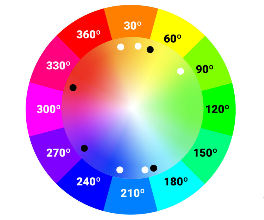
Working with the color wheel side by side I was comparing the colors we had and the ones we wanted to add.
I needed to figure out a consistent system for the generation of our color tints throughout all hues. That’s why even though I started working with colorbox.io, I finally decided to generate our own system. I would show you all a screenshot of the artboard at that point but I guess you imagine the mess… It’s full of (too) many different stripes of different colors to understand how they behaved. I was constantly going back and forth comparing the ones imported from colorbox.io with my own.
Not all colors were going to behave the same, as luminosity changes from color to color; and that is decisive in determining the color's behavior. The luminosity of each color and achromatopsia vision gives you an estimate of how different colors behave. Achromatopsia also gives us an idea of how the phenomenon of Helmholtz–Kohlrausch effect affects how we perceive color. It is a perceptual phenomenon that makes colors with approximately the same luminance level not appear equally bright or dark. The saturation of spectral hue is perceived as part of the color’s luminance. And there is nothing that can be done about that but learning to take advantage of these intrinsic peculiarities.
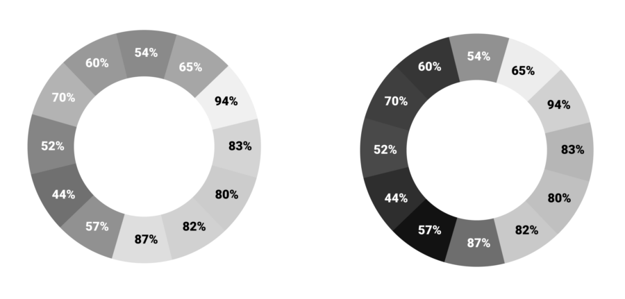
So with an aligned tint system that worked across all colors, I started adding the rest of the hues we had in mind. And that’s when I realized that I was actually not adding all colors. At this point, I started thinking about the reason behind adding certain colors and leaving others out.
And that’s when all the problems started... 😀🔫
This iterations in the color palette imply a high cost on our development side and the reasoning behind the changes better be strong and informed.
Eventually, I decided to pause on the work; take a step back, and look at it from a distance. And something that I have been doing lately with all my projects related to color… I decided to stop focusing on color. I have learned that color is not reliable and there are no two people that see one color the same, same as not two screens show it the same way.
It’s funny that I am constantly in this position coming from Fine Arts, but yeah:
Don’t… ever… trust color
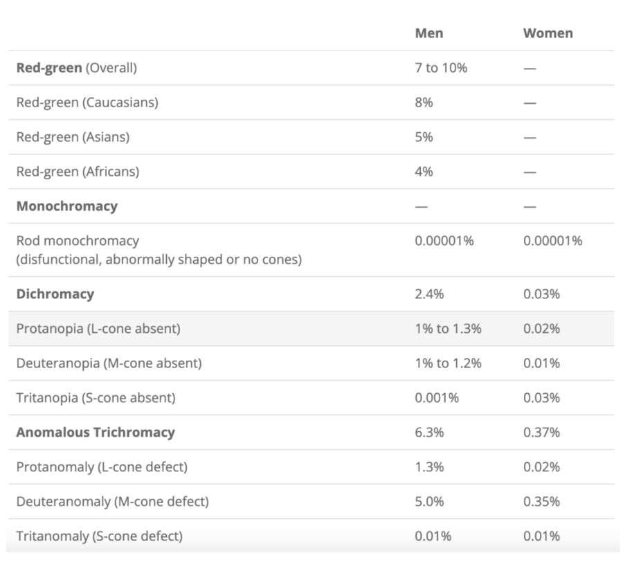
And I asked myself: how do others actually perceive color…?
Did you know there are 8 different types of visual anomalies? With the “normal” one, there are 9 different ways of perceiving color. And I bet there are even people that are somewhere between two types…
Sooo… I meaaaan… 🤯
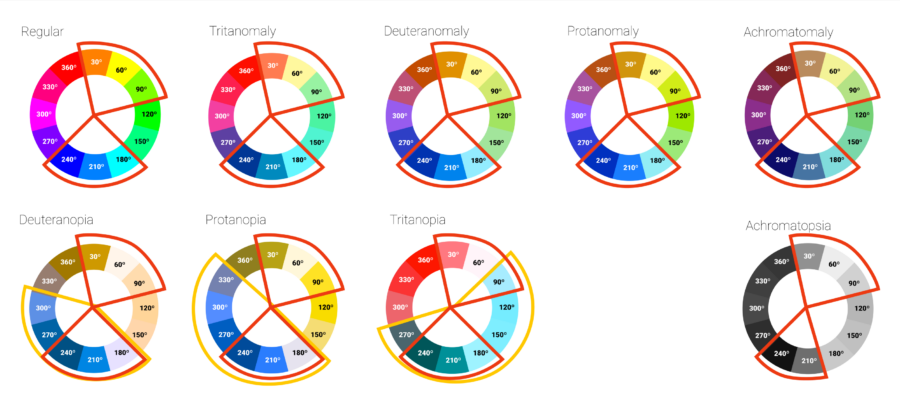
I started comparing the color wheel with all the different visual anomalies, and from there I decided to determine a “safe color zone”. The idea here was to find the common denominator in all those different visual perceptions. This was a good exercise to understand which would be the best colors to add to our current ones.
This approach would allow us to build a color palette heavily prepared to support accessibility. TrustYou’s accessible UI color palette. (❤ ❤ Yes, I am so proud! ❤ ❤)
With all this information I decided to keep the new yellow and turquoise colors we had added. I slightly modified the darker blue to distance it in the color wheel from our main light blue (improving accessibility) and ended up removing the purple and pink. Another important part of the process was thinking about namings for all tints.

Marketing and product sat together to review the palette and see if the new colors were working for the rebranding they had going on and some small last iterations were made.
The final test was putting color combinations into play and seeing how they would behave from an accessibility point of view. And this is very important to us at TrustYou when referring to data visualization as we are a company that bases on data.
When doing combinations like this, something to bear in mind in order to increase accessibility is, using different tint intensities in order to help generate bigger contrasts between colors.
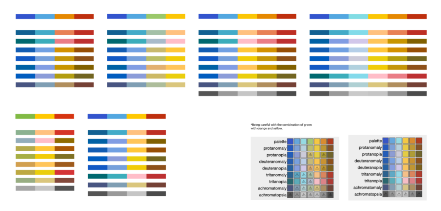
There is no one way to approach a problem, nor a single way to solve it, and definitely, there are no two problems that can be solved with the same solution. I hope you liked ours, and same we were inspired by others you get some inspiration from this 🙂
Thank you to all the TrustYou team for providing the flexibility and open-mindedness to proceed with initiatives like this ❤
Special thanks to all my engineers, to my product team, and of course (again) the marketing team.

