TrustYou Mobile App – A Complete Revamp of the Interface and User Experience
The goal of this project was to launch a complete new version of TrustYou’s mobile app to provide users with an overall better experience, by bringing the look and feel up to modern standards as well as improving speed and performance. The initial redesign included a new interface and navigation, keeping in mind that the product roadmap would likely scale and include additional features in the future. We also worked on implementing better event tracking in order to collect usage data that would allow us to validate and decide how to further evolve the product.
Given our past experience with maintaining two native apps, and the feasibility of redesigning and rewriting everything from scratch, the engineering team took the decision to build our new mobile app using React Native. This allowed us to develop faster, but also introduced some challenges in terms of designing a single app that was compatible with the standards and patterns from both Android and iOS platforms.
Phase 1: Understanding the Current State
Determining usability issues and analysing user feedback to define initial product specifications.
Identifying Usability Issues
Before starting the redesign process, we tested and analyzed the current version of the mobile app in order to determine existing usability issues and suggest initial improvements. The identified issues were impacting the user experience and the overall appearance of the app. The most critical issues were related with target sizes, navigation patterns, and visual design items such as layout, legibility and consistency. For this analysis, we also took into account Material Design Guidelines for Android, Human Interaction Guidelines for iOS and accessibility patterns such as target areas and thumb zones.

Analysing User Feedback
Shortly before we started the project, our Customer Success Team distributed a survey among our users to understand the current usage, pain points and possible improvements or important features that were missing. Most of the concerns of the survey participants referred to performance, data irrelevancy and poor usability. We used this feedback to refine some of our initial product specifications and also as a starting point for establishing a more in-depth user research process.

Phase 2: Ideating & Prototyping
Validating initial ideas with the product and design teams, in order to build a testable prototype.
Sketching & Wireframing
The product team analysed the collected data and the known usability issues to define a first set of features and improvements that needed to be addressed. This was the first step that helped the design team to define a hierarchy of interactions and navigation patterns across the application.

Testable Prototype
After iterating on some ideas and discussing them among the product and the design teams, we prepared a high fidelity prototype with low fidelity interactions. To build this we used Invision, since their mobile app would allow us to test it directly on mobile devices. The goal of this prototype was to validate if this new version of the mobile app would indeed meet customer needs and expectations. Testing this prototype would also allow us to collect additional information about other features and use cases that we might have overlooked.
Phase 3: Usability Testing and Interviewing
Testing the usability and visual design of the new app, including topics such as data visualisation and data relevancy.
Research Communication Plan
In order to recruit customers to test our designs, we collaborated with the research team and other departments such as Customer Success and Key Account Management, to create a Mailchimp campaign that we distributed to all relevant accounts and users that were part of our user research pool. This campaign contained a brief explanation of the research initiative and a Calendly link with available slots to schedule a session. Our plan was to recruit at least five customers through the predefined time slots in Calendly since studies show that testing with five participants usually uncovers 85% of the usability problems.

Methodology
The research consisted of contextual inquiry and usability testing sessions of approximately 40 minutes long, which were conducted remotely, using the so-called “Hug The Laptop” method. This is something that our design team picked up from Hannah Pileggi, Head of Research at Duolingo, at one of the Smashing Conferences, and involves the test user switching their laptop around to broadcast their phone screen via their laptop’s webcam.


Photos and video from a hug-the-laptop demo session.
We defined an initial interview script and a set of tasks to be tested with our users, which was then refined with the help of the research team. The script and tasks were distributed in different categories, which would allow us later to conduct a thematic analysis with the obtained data. Additionally, we also defined a set of hypotheses and assumptions that we wanted to validate.
Phase 4: Analysing and Sharing Results
Analysing and documenting the most important findings and insights from the research, and sharing them with the relevant stakeholders.
Thematic Analysis
The analysis of the qualitative data was conducted using a thematic analysis methodology to identify the main themes and patterns from the interviews. This allowed us to classify and determine the most important insights and findings from the research, and to validate or disprove our hypotheses.

The hypotheses were assumptions related with visual design, usability, and data visualisation that were included in the interview script. Following are the most relevant ones, accompanied by the conclusions that allowed us to either confirm or disprove them:
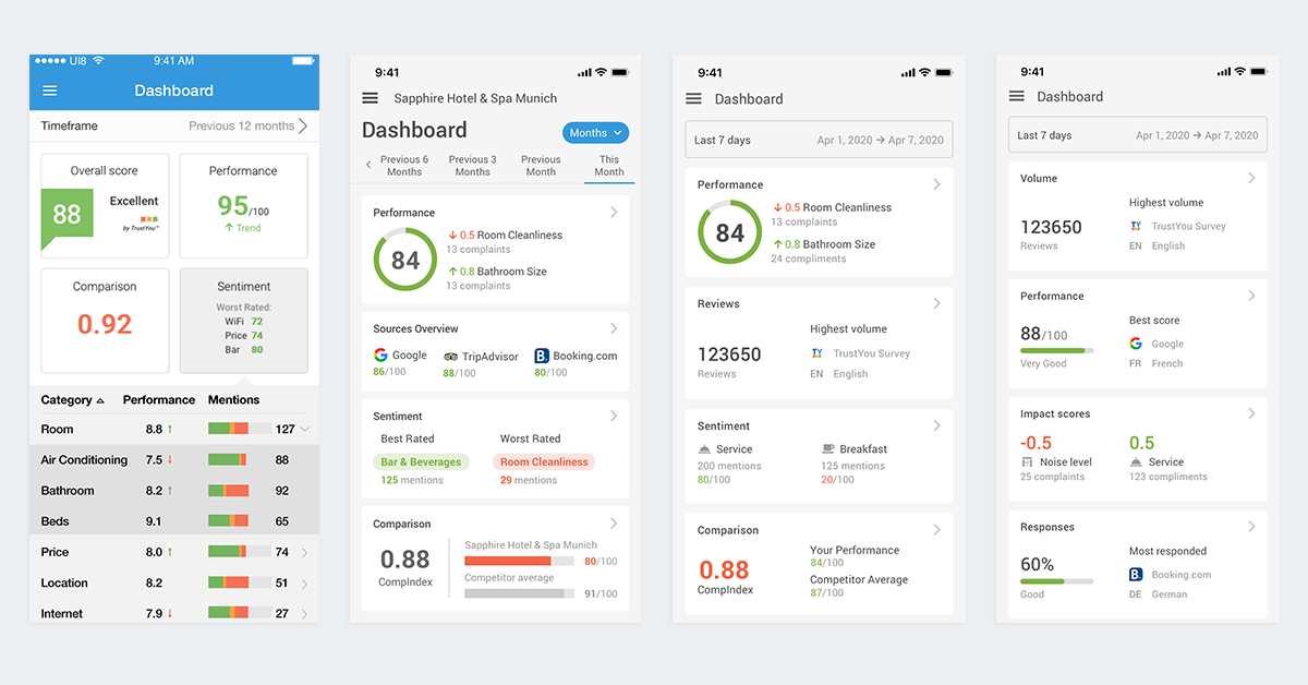
✅ Confirmed: Having full width tiles in the dashboard brings consistency and allows to display more information, ensuring legibility for different languages.
All the participants showed a positive reaction to the new layout and mentioned that it was clearer to understand and read the information.
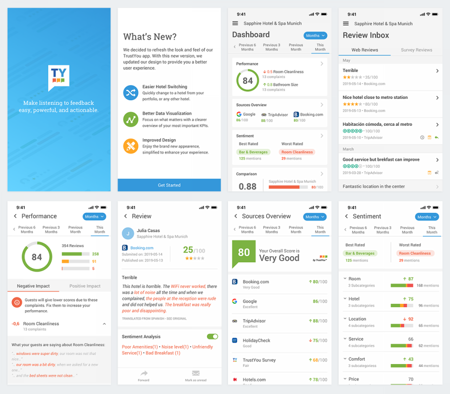
❌ Disproved: Users might be interested in knowing which changes were introduced in the new version, by reading a ”What’s new screen” after logging in:
Most of the participants immediately skipped or ignored the intro screen that explained the updates. Only a small percentage of them showed interest, but only scanned the titles.
✅ Confirmed: Different background and font weight is enough to differentiate new reviews from read reviews.
Most of the participants understood the difference between read and unread reviews, mentioning that it was something that they were already familiar with since they are used to similar patterns in their email providers.
❌ Disproved: Switching off/on the sentiment analysis highlight improves the legibility and visualisation of a review detail.
All the participants mentioned that they did not find this feature useful, as they did not feel that it added any value to their experience and it didn’t provide further interactions.
➖ Needs more data: Enterprise users can easily switch and search for hotels inside the drawer menu, after tapping on the caret next to their defaults hotel’s name.
For this specific assumption, we were not able to gather enough information to validate it. However, we decided to launch the app with the proposed design, analyze usage data and gather more feedback to make a better decision.
Task Success Rates & Sentiment Analysis
Although the research was focused on gathering qualitative information, it was also possible to establish metrics in order to measure task success rates as well as perceived ease of use and satisfaction. Thanks to an automated sentiment analysis process that our research tool, Dovetail, allowed us to run, we were also able to determine a general balance of positive vs negative sentiment based on our users’ feedback.

Phase 5: Acting on Findings
Applying the research findings to refine the current designs, and informing product and development of the most important insights.
Product Roadmap and Development
The results from the user research gave us useful insights in terms of roadmap prioritization, since the most mentioned pain point referred to missing features.
Data accuracy and consistency was the second topic in this list, as it was a common issue with the previous version and a concern from most of our users. Our participants expressed the importance of having the same information and look and feel in both desktop and mobile experiences. This insight has helped to focus the development efforts on making sure that our data is always accurate and transparent, and to improve consistency in our visual design and user experience across all our platforms.

Usability Improvements
After testing our initial designs, we discovered critical usability issues that were mainly related with navigation patterns and unnatural gestures. However, one of the most important discoveries from this phase was to understand how the complexity of our data, and the way we displayed it, impacted the cognitive load of our users. Since then, one of our main goals has been to improve the way in which our data is visualized and represented.
Iterating & Improving
We have been constantly improving the user experience by conducting regular tests and validating with quantitative data.
Unmoderated Testing & Quantitative Data
Since we launched the first version of this redesign, we have been introducing different research methods and channels to obtain insights that we can correlate with usage data from the events that we are now tracking. We often conduct quick and short tests through UsabilityHub, which allows us to get feedback and validate our ideas in a much faster and inexpensive way.

Design System
After successfully launching the new version of the mobile app, which introduced new components, navigation patterns and interactions, we decided to make these part of our design system, which helps us stay consistent across all our platforms. Together with the design and engineering teams, we are working to make TrustYou Brew a unified design system for all our products and experiences.
Conclusions
After launching the new version of the mobile app, we decided to reflect on our process and our learnings, and to document our experience of designing mobile products.

Designing a mobile experience has been a process of constant learning, testing and iterating. It’s a fast paced environment in which new patterns and interactions are often introduced. Since the beginning of the project, we have tried to embrace change throughout the process, to constantly challenge and validate our ideas, which in return has increased the delivery time for improvements and new features and brought more consistency to the user experience across the platform. This rapid and agile rhythm has allowed us to easily test out new concepts that we then are able to bring to our desktop products as well.
As mentioned before, one of our biggest challenges has been finding a common ground in terms of patterns, gestures and even components that accommodate both iOS and Android devices. As a general rule, we try to not pick a specific solution from any platform unless it’s the best approach that we can find to deliver an optimal user experience.
When designing within a framework that serves many platforms, which usually differ a lot from each other, one of the most important topics for us has been to define navigation patterns. How do my users go back and forth between content and activities? Which artifacts and components do we use to communicate hierarchy and navigation? In our experience, these are some of the founding principles that you need to understand and share among the team in order to deliver a simple but uniformed mobile experience that is not strictly tied to any specific system, but following the best practices.